
In this instalment Brian Long looks at how action components can simplify User Interface (UI) development.
This article first appeared in Linux Format Issue 22, Christmas 2001.
Click here to download the files associated with this article.
If you find this article useful then please consider making a donation. It will be appreciated however big or small it might be and will encourage Brian to continue researching and writing about interesting subjects in the future.
Our text processor application got a visual makeover last month, but there are still improvements that can be made. Many applications ensure that menu and toolbar options are enabled and disabled as appropriate (proactive validation), but all the options in our application are enabled all the time, they just do nothing if it is not appropriate (reactive validation).
This month we will focus on a new area in Kylix: actions and action lists. Actions are non-visual components that serve two purposes in helping build application UIs. They simplify the job of setting up a UI where there may be several controls that can invoke any given aspect of the program (such as a menu button and a toolbutton). Actions also make it simple to separate the code that does the job you are trying to achieve (the doing code) from the code that validates whether that job is appropriate (the checking code). Splitting these two logical tasks apart makes implementing and maintaining each one more straightforward.
We have seen that Kylix allows event handlers to be shared between different events of different components. This is a great mechanism for code sharing, but still has a downside. If you want to perform proactive validation, you are obliged to enable and disable every control that can invoke a given piece of code as appropriate.
This may start out being no great problem, but as you add more and more proactive validation (which seems to be where the slick UIs are heading), it can turn into a bit of a maintenance problem. Each time you add a new toolbutton or menu item (or whatever control you need) you must amend your code to take it into account. When the program starts up, you need to perform a sweep of validation of all functionality to ensure the controls start off in a default state. If you try it out, it gets a bit tedious, to say the least. Actions remove these problems.
Before we dive into actions, we should look at the event model a little more. As we've said before, event handlers are used to customise the behaviour of components on a form and the form itself, but the actual code is always implemented as form methods. Since the components never implement their own custom code, but delegate the responsibility to another object (the form), they are said to use a delegation model.
This event model allows event handlers to be shared by events of the same or even different components. For example, if you have a menu component set up with an OnClick handler, you can have a button's OnClick event use exactly the same event handler. Just select the button on the form, select the OnClick event in the Events page of the Object Inspector, drop down the list of possible values and you will see all the available, compatible event handlers. Choose the appropriate one and the event handler is shared.
This means you do not need to duplicate any of the code from the event handler, which is generally considered to be a bad practise. You can also rename the event handler to a more descriptive name if you need, so long as you enter the new name in the Object Inspector, over the top of the routine's current name.
Shared event handlers allow you to write code once, but have it easily invoked by a variety of components. This is a commonly used process, but you sometimes need to have some of the code execute differently depending on which component triggered the event, or maybe its type. This is also quite straightforward, as most event handlers have a Sender parameter, which is a reference to the object that triggered it. For example, a button's OnClick event handler looks like this:
procedure TForm1.Button1Click(Sender: TObject);
begin

end;
You can see that the only parameter passed to this routine is Sender, which will represent the button. In fact the OnClick event handlers of most components and a vast number of other events as well have exactly the same parameter list, making it possible to share code in event handlers across many different component events.
Because it could be virtually any component that triggers an event with this kind of shared event handler, the parameter must be declared in some generic way, making it applicable to any component. As you can see above, this is achieved by declaring it as TObject. TObject is the base class of all classes in the CLX library. This means all classes inherit either directly or indirectly from TObject.
The process of inheritance is a way to build new classes, whilst taking advantage of already written classes. If you have a requirement to build a class, and another class already implements some portion of your needs, you can make your class inherit from it. Your class is then a superset of the original class, and you get already written (and hopefully tested) behaviour, effectively for free.
CLX is rich with inheritance. The class hierarchy features many classes on many levels, with careful thought having been put to which classes contain what behaviour for most effective reuse through inheritance.
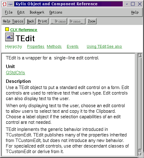
Figure 1: A typical CLX class help page
You can get a flavour of the CLX hierarchy from the help system. You can get context sensitive help from the Component Palette, the Form Designer, the Object Inspector and the Code Editor. Figure 1 shows the help for TEdit, the class type of an edit component. It provides easy access to the help for all the properties, methods and events of the class and also has a popup link to the inheritance hierarchy for it (see Figure 2).
Figure 2: The TEdit class hierarchy
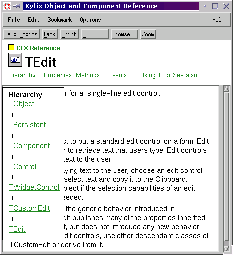
TEdit is built through six levels of inheritance. TObject provides the standard behaviour of all Kylix objects (a number of housekeeping methods). TPersistent adds the ability to support basic streaming. TComponent adds the ability to become a component, including liaising to some extent with the Kylix IDE. TControl adds generic control behaviour, such as painting itself on a parent, and co-ordinate support. TWidgetControl adds the ability for the class to represent a widget from the underlying Qt widget library.
TCustomEdit adds in all the behaviour and properties required by an edit control. However, TCustomEdit doesn't publish any of these properties, meaning none of them will appear on the Object Inspector for setting at design-time. TEdit inherits everything from TCustomEdit and publishes the properties appropriate to the class. Other descendants of TCustomEdit can publish different combinations of properties, and add extra behaviour and properties if necessary.
Incidentally, knowing that a published property appears on the Object Inspector will help you understand the information in the property listings in the online help, as that term is used to denote properties that will be available at design-time.
Various classes share a common ancestor (all controls inherit from TControl, all components inherit from TComponent, all objects inherit from TObject) and inheritance is really all about building supersets. Because of this it is perfectly acceptable to treat any object as if it were declared as one of its ancestor classes, for example it is valid to treat a TEdit object as if it were actually a TControl. This is because a TEdit object is a TControl, but with a whole load of extra stuff from TWidgetControl, TCustomEdit and TEdit as well.
All this helps explain why the Sender parameter in event handlers is declared as a TObject. This allows it to represent as many objects as possible since all classes ultimately inherit from TObject. If it was declared as TButton, then it would be specific to button components and miss out on all the other components on offer. It could have been declared as TComponent, to allow any component to be accessed through it, but declaring it as TObject means non-component classes can also use this kind of event handler.
After all that talk on inheritance, the low-down is that in shared event handlers the component that triggered the event is accessible through Sender. So in a shared event handler you can write generic shared code, and also write code that executes differently dependent on some aspect of the object represented by Sender. This allows a shared event handler to branch for a specific component, such as:
procedure TForm1.FormCreate(Sender: TObject);
begin
  //Initialise the random number generator
  Randomize
end;

procedure TForm1.SharedOnClickHandler(Sender: TObject);
begin
  //Colour values are 3 sets of 8 bits each for red, green and blue,
  //making a 3 byte number. The max value (in hexadecimal) is
  //therefore $FFFFFF. Add 1 so Random gives a random colour
  Color := Random($1000000);
  if Sender = MenuItem1 then
    MenuItem1.Checked := True
end;
The form's OnCreate event handler initialises the random number generator so the form can be given a random colour in the shared OnClick event handler. Regardless of who triggers the OnClick handler, the form's colour changes, however if it was MenuItem1, then in addition its Checked property is set to True, meaning the menu item gets a checkmark next to it.
This is fine for checking for a particular component, but what about when you want to check for a particular class of component? For example, you want to ensure that all menu items that trigger an event are given a checkmark. You will instantly find that having Sender declared as TObject means that you can only access the TObject-defined members through the Sender parameter (trying to reference Sender.Checked will give a compiler error).
To overcome this limitation, you must tell the compiler to treat Sender as a TMenuItem, rather than the considerably smaller TObject, using a typecast operation. However, you must only do this if Sender represents a menu item, so you must also check whether this is the case. The following listing shows how to identify whether an object (such as a component on a form) represented by an object reference (such as Sender) is actually defined in terms of a specified class or inherited from that class.
procedure TForm1.SharedOnClickHandler(Sender: TObject);
begin
  Color := Random($1000000);
  if Sender is TMenuItem then
    TMenuItem(Sender).Checked := True
end;
This will check all menu items that trigger the event, but do nothing special (other than the common colour changing code) for any other component. This form of typecasting is called a hard cast or compile-time cast.
If you were setting up an event handler that was intended to be shared only between components of the same type (for example, just between a variety of menu items), you might be tempted to omit the if statement and go straight for the typecast. However, this is dangerous and should be avoided. At some point in the future, the event handler may be shared with something other than a menu item, and the hard cast would lead to a nasty error (potentially involving program termination). Instead, you should use the runtime cast operator, as shown here:
procedure TForm1.SharedMenuOnClickHandler(Sender: TObject);
begin
  Color := Random($1000000);
  (Sender as TMenuItem).Checked := True
end;
Note that this technique can also be used in a non-shared event handler to safely access the component whose event fired without using the normal identifiers, such as Button1 and Edit1.
In summary, the is operator checks whether an object is of a specified type (or inherited from it) and returns True or False. The as operator performs the same runtime check; if it returns True, the typecast is executed but if False, an application exception is raised.
To get the hang of actions, let's build a small program that involves user interaction (as most programs do) and employ actions to help the UI work smoothly.
In a fresh application, add an edit control called edtEntry (with its Text property cleared) and a listbox called lstEntries to the form. This program will allow users to type in a string in the edit and have it added to the list. The list will also support deleting items and editing them, however at this stage, no controls need to be added to support these operations (no menu items, no buttons, no tool buttons).
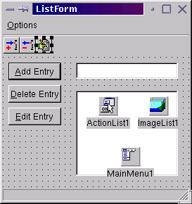
Now add an action list component from the end of the Component Palette's Standard page. This non-visual component manages a list of actions that will represent each of our possible user operations. It doesn't have any interesting properties of its own other than Images, which allows it to connect to an image list, to store images that represent the actions. We should add an image list component to the form (from the Common Controls page of the Component Palette) and make the action list's Images property point to it (but we'll add the images later).
Double-click the action list component to invoke the Action List Editor, and press the yellow button three times to create three new action components. Once they are created, you can select these objects either in the Action List Editor or in the Object Inspector's instance list. Change their names to actAddEntry, actDeleteEntry and actEditEntry (see Figure 3).
Figure 3: Properties of a TAction component
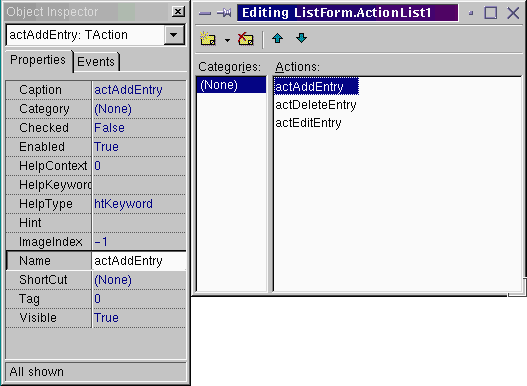
Note that despite being non-visual itself, an action component's properties are mostly UI-based. This is because when we eventually put the components on the form that allow the user to trigger the action's behaviour (referred to as action clients), each component will absorb the relevant properties from the action it is associated with. Set up the properties as follows (note that the Category property is simply for your own organisational benefit and can be any string value you want to use):
actAddEntry
Category = 'List'
Caption = '&Add Entry'
Hint = 'Add entry|This adds the edit content to the list'
ImageIndex = 0
ShortCut = Ctrl+A
actDeleteEntry
Category = 'List'
Caption = '&Delete Entry'
Hint = 'Delete entry|This deletes the selected item from the list'
ImageIndex = 1
ShortCut = Ctrl+D
actEditEntry
Category = 'List'
Caption = '&Edit Entry'
Hint = 'Edit entry|This replaces the selected entry with the edit content'
ImageIndex = 2
ShortCut = Ctrl+E
To get full ultimate benefit from the hints we set up in the actions, set the form's ShowHint property to True, then add a status bar component to the form (from the Common Controls page) and set both AutoHint and SimplePanel to True.
With the basic UI attributes of these actions defined, we can now concentrate on the code. Each action can be given an OnExecute event handler in which you write the code that the action should perform. Actions also have an OnUpdate event, whose handler should contain update code that you expect to regularly execute.
Any change that you make to an action property will immediately propagate to the connected action clients. So this means that if you set an action's Enabled property to False in an OnUpdate event handler, any buttons, menu items, toolbuttons, etc. that are clients of the action will instantly disable. The same applies to any other property.
Let's decide that the add action adds the edit content to the listbox, but does not permit any duplicates or blank strings. Also, after adding, the edit control is given input focus and has its content highlighted (so it can be replaced by typing, or can be edited). Given these rules, the two event handlers could look like:
procedure TListForm.actAddEntryExecute(Sender: TObject);
begin
  lstEntries.Items.Add(TrimRight(edtEntry.Text));
  edtEntry.SetFocus;
  edtEntry.SelectAll
end;

procedure TListForm.actAddEntryUpdate(Sender: TObject);
var
  EditText: WideString;
begin
  EditText := TrimRight(edtEntry.Text);
  //Set Enabled to True if non-blank, non-duplicate
  //string is in the edit, else False
  (Sender as TAction).Enabled :=
    (Length(EditText) > 0) and (lstEntries.Items.IndexOf(EditText) = -1)
end;
When the action is executed, the edit control content (with any trailing white space stripped off) is added to the listbox. However, the OnUpdate handler ensures that the action is only available if the edit contains a string which is not blank (its length is greater than 0), and is not already in the list (the index of the new string is returned as -1, meaning it could not be found - the strings in the list start at index position 0).
The beauty of actions is that you don't need to worry about calling OnUpdate - it is called automatically when the program goes idle, which amounts to immediately after every time the user presses a key or moves the mouse over one of the application's forms. As long as you ensure the code in OnUpdate is not time consuming, things will work smoothly.
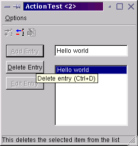
The delete action will delete the selected item from the listbox, but only be available if an item is selected. The edit action will replace the selected entry with whatever is in the edit, but will only be available if an item is selected and the replacement isn't blank and won't be a duplicate. The code for these two actions looks like this:
procedure TListForm.actDeleteEntryExecute(Sender: TObject);
begin
  lstEntries.Items.Delete(lstEntries.ItemIndex)
end;

procedure TListForm.actDeleteEntryUpdate(Sender: TObject);
begin
  (Sender as TAction).Enabled := lstEntries.ItemIndex <> -1
end;

procedure TListForm.actEditEntryExecute(Sender: TObject);
begin
  if actAddEntry.Enabled then
    lstEntries.Items[lstEntries.ItemIndex] := TrimRight(edtEntry.Text)
end;

procedure TListForm.actEditEntryUpdate(Sender: TObject);
begin
  //Allow this action if an item is selected in
  //the list, and the edit control has a non-blank,
  //non-duplicate value to replace that item with
  //(meaning the add action will be enabled)
  (Sender as TAction).Enabled :=
    (lstEntries.ItemIndex <> -1) and actAddEntry.Enabled
end;
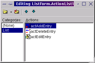
We now need to add some bitmaps to the image list for the actions' ImageIndex properties to index into. Use the image list editor (invoked by double-clicking the image list) to add three bitmaps, one for each action. If you cannot find any appropriate bitmaps of your own, you can resort to insert.bmp, delete.bmp and edit.bmp, which can be found in Kylix's images/buttons directory.
After adding the bitmaps, and stripping out the colourless versions (if prompted), as per last month, you should find the Action List Editor reflects the associated images (see Figure 4).
Figure 4: The actions with associated images
Now the actions are complete, we can set up some action clients. To start with, add three buttons onto the form and set their Action properties to actAddEntry, actDeleteEntry and actEditEntry respectively. As you connect each button to its corresponding action, you will see all the relevant action properties being absorbed by the button. These include Caption, Enabled, HelpContext, HelpKeyword, HelpType, Hint, Visible and also the OnClick event handler (whose value is the action's OnExecute event handler), although you will probably only notice the properties whose values become different.
To allow the user to add strings to the list by pressing the Enter key, set the Default property of the button connected to the add action to True.
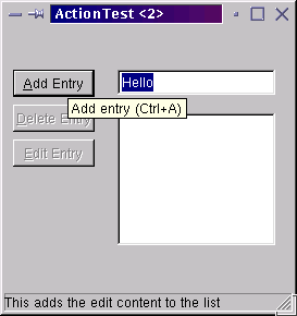
Run the program and you will see that the three buttons are immediately disabled (Figure 5), as their three corresponding actions have been disabled by their OnUpdate handlers. The actions' change of Enabled has propagated to the connected action clients (the buttons).
Figure 5: Buttons under the smooth control of actions
As soon as you start typing in the edit control, the add action (and consequently button) enables, as is sensible. When you add an item to the list and select it, the delete action/button enables, and if you enter a new value in the edit control, the edit action/button enable. So each action client is enabled and disabled automatically based on the criteria in the OnUpdate event handler.
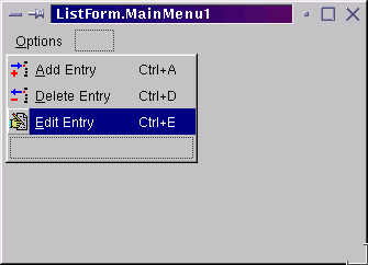
Now let's try out some more interesting action clients. Drop a main menu component on the form and connect its Images property to the image list component, so the menu items can use their ImageIndex to select an associated bitmap from the list.
Double-click the menu component to invoke the Menu Designer and add a top-level menu item with a caption of &Options. Now add three menu items below this and connect them to the three actions by their Action property. These action clients absorb the same action properties as the buttons, but also take Checked, ImageIndex and ShortCut (see Figure 6).
Figure 6: Menus connected to actions
The next job is to add a toolbar component (from the Common Controls page). Set its Flat and AutoSize properties to True, and connect its Images property to the image list so the toolbuttons can also use the bitmaps therein.
Right-click on the toolbar and select New Button three times to get three new toolbuttons. You will notice that toolbuttons automatically index into a connected image list, but don't be put off by the bitmaps that show up. You still need to connect these action clients to the corresponding actions so all the relevant properties can be absorbed (see Figure 7).
Note that the action's Checked property is copied to a toolbutton's Down property, meaning a toggle option can be represented by toolbuttons being down (depressed) or up.
Figure 7: Toolbuttons also connected to the same actions
Try running the program now: you will find that the toolbuttons, menu items and buttons all enable and disable according to the coded criteria, with no effort made on our part to make sure things are kept up to date (see Figure 8). You can now see the prime benefit of actions being demonstrated (the other benefit was separating the main code in OnExecute from the validation code in OnUpdate).
Figure 8: The finished action application
As well as implementing your user-invokable application logic in actions, you should know that Kylix comes equipped with reusable pre-built actions, called standard actions. To get a standard action in the Action List Editor, either drop down the little arrow next to the yellow button (visible in Figure 3 and Figure 4) and select New Standard Action, or press Ctrl+Insert (see Figure 9).
Figure 9: Kylix standard actions
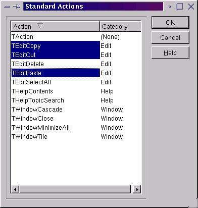
When you select a standard action, it initialises its UI-related properties with sensible default values, including adding an image into the associated image list, and setting ImageIndex appropriately. However, in some cases (such as some of the Edit category actions), the added bitmap is incomplete and will need to be replaced with another image, due to a small bug.
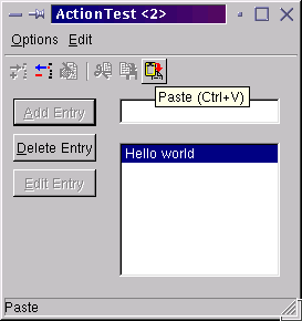
To show the idea of these generic, reusable actions, we will add the selected clipboard-related items to our action list, and add corresponding menu items and toolbuttons to the form that act as their action clients. Without any extra code, the menu items and toolbuttons will enable and disable based on whether the represented actions are valid for the active control.
Figure 10 shows the edit actions working. The edit control in the application is active, and there is some text in the clipboard, so the Paste action is enabled, whereas the cut and copy actions are disabled, thanks to no text being selected in the edit control. Extra program behaviour, for free!
Figure 10: The edit actions working
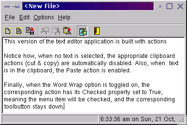
On this month's CD you will find this action test application (ActionTest.dpr), as well as a new version of the text editor program developed previously, but which has been modified to use actions for its functionality (TextEditor3.dpr, shown running in Figure 11).
Figure 11: Our text processor application, built with actions
This month we saw that custom actions and standard actions are great for helping build a modern, reactive UI for your X application, and also help keep your code a little more maintainable. We also saw how shared event handlers can be tailored depending on who triggered the event, using safe object typecasting.
Next month we?ll look at more useful Kylix development areas. Until then, happy coding.
Brian Long used to work at Borland UK, performing a number of duties including Technical Support on all the programming tools. Since leaving in 1995, Brian has spent the intervening years as a trainer, trouble-shooter and mentor focusing on the use of the C#, Delphi and C++ languages, and of the Win32 and .NET platforms. In his spare time Brian actively researches and employs strategies for the convenient identification, isolation and removal of malware.
If you need training in these areas or need solutions to problems you have with them, please get in touch or visit Brian's Web site.
Brian authored a Borland Pascal problem-solving book